Read time: 3.5 minutes.
In today's issue, we're talking about the importance of first impressions.
But not like the ones you've commonly heard about. The digital age has brought about an attention economy that doesn't favor the majority. Let me tell you, digital-first impressions are even more important than their real-life counterpart.
If you fail to nail a few simple things, you'll never regain the users' attention.
Picture yourself thumbing through social media.
You come across what seems like an unlimited amount of content, from millions of different creators. And some of it convinces the click.
Whether for good or bad reasons, a profile click is a profile click. And that means we can "sell the follow".
Take a look at this Tweet I recently put out.
Treat your profile like a landing page.
— Joseph Seifert (@JosephSeifert22) October 14, 2022
But don't sell the product.
Sell the follow.
Then you get far more chances at a potential purchase...
Focus on the first line. The one where I say to treat your profile like a landing page.
If we follow the typical flow of judgements that viewers tend to make, we can fix the game to work in our favor...
👨🏻⚖️ Judgments
When they eventually land on your profile, they have two options.
Just two choices to make. They either follow you or they don't. Plain and simple.
And there are a few subconscious judgments made in seconds. It's a ruthless test to pass in all honesty. The viewers' mind is made up in a heartbeat and they have no remorse.
That's why we need to get a few things in order.
Profile Picture
First, they try to see if you're a real human.
That's a big one. Especially when you're discovered out in the open lands of the home feed, a solid profile picture is a major trust builder. Obviously, faceless accounts are still human. But a high-quality headshot just humanizes the digital landscape in a way that a Notion characterization cannot.
But look at Easlo, he's about to hit 200K on Twitter and uses a Notion Drawing.
Still, a pretty face is really an ace.
Following Ratio
I don't know about you, but following the picture scan, my eyes tend to head toward the follower counts.
I hate to be that guy who cares about followers, but let's be honest here. We all care about followers. Everyone darts right to the ratio.
When you're following 12K people and have 47 followers it just looks... I don't know. A little desperate.
People enjoy the follow for follow strategy and sure, it works to a certain degree, but it's not my cup of tea. I prefer the organic method.
Bio
If your ratio was deemed worthy, you've earned their attention for the bio.
Don't mess this up. There are a few essential components. Make sure to include who you are, what you do, and what you're doing.
Pretty simple. But to get there, we need to understand the fears and desires of the audience we're attempting to attract. It's all about showing the viewer how we can help them. Here's mine:

It's quite clear:
- You know who I am (a writer, freelancer, and solopreneur)
- You know what I'm doing (documenting my growth)
- You know how I can help (teach you to make money writing)
Try to do something similar with your own bio. It's not set in stone, but this does work well for me.
Pinned Post?
I use the question mark because it's not mandatory.
But if you're going for it, this better be your best piece of content.
They made it this far, so we got 'em on the hook. We're right there. So close to nudging them through the door. To click that follow button.
This also works as a form of social proof because validation from the public is one of the best psychological triggers. It tells them that they should desire it too if most other people are interested.
A lot of people use a high-performing thread. That's currently what I do too.
Bonus
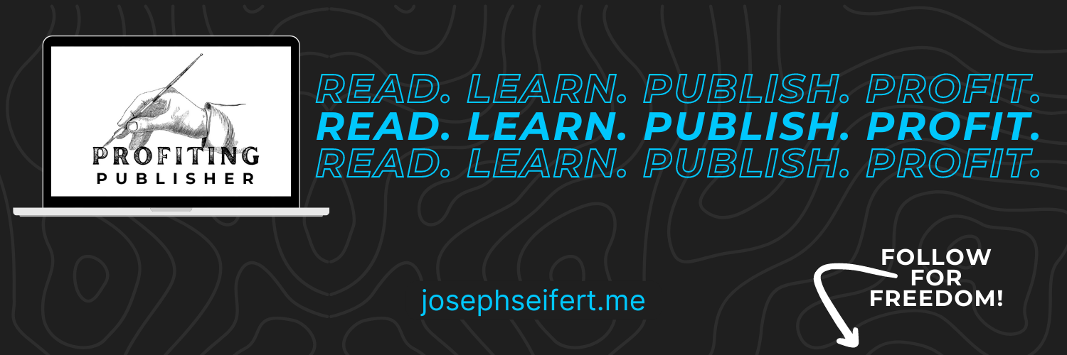
You could even add a nice, branded banner as a bonus.
It should tell the visitor what you're about. A lot of people use icons and symbolism to convey their message. I, myself, use it as a way to market my website.
A great call to action works too. Mine points to the follow button with a message.
Here's a sneak peek at my social banner:

🧠 Final Thoughts
The essence of why we do this is to make a good (digital) first impression.
If we mess this up, it could cost us a follower. And as you know, we all care about followers (for the most part).
If I could offer one piece of advice, it would be to take advantage of creativity.
The more we can differentiate ourselves to potential followers, the more value they'll see in our accounts. That's a good thing. We don't want to be just another creator. We want to be THE creator they go to for specific needs.
Be the differentiator.
❤︎ Enjoy this newsletter?
Let me know. Send me a testimonial here.
Can I help you? Order my writing skills here.
Wanna make money writing? Learn how here.


